Kenji Kaneko
 

RoadCode

Helping traffic engineers make more informed
traffic safety decisions


zoomedMacBookAir.png


OVERVIEW

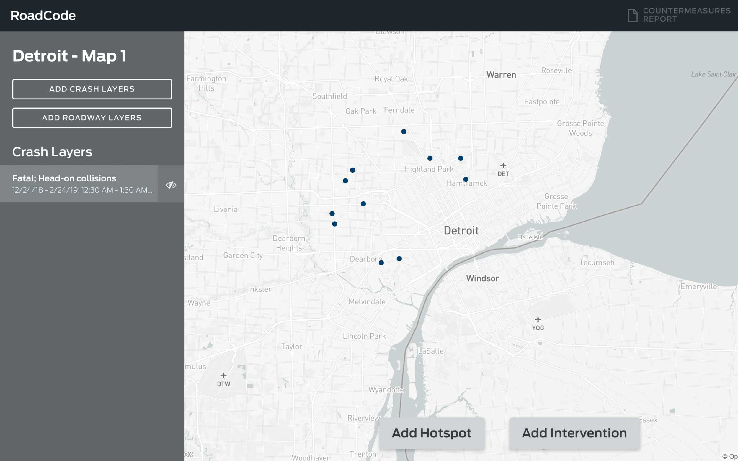
I led design for a project born out of a collaboration between Ford and FordLabs: RoadCode, a safety visualization tool aimed to help traffic and safety engineers make more data-informed safety decisions.

The project originally kicked off as part of the US Department of Transportation’s “Solve for Safety” competition and, due to the success of our team and the project, RoadCode became a fully commercialized product by Ford. RoadCode was selected as one of two finalists for the competition (out of a field of over 50 entrants including Uber and Allstate Insurance).


ROLE: Product Designer


TEAM: Product Manager, Product Owner, Engineers (4), Data Scientist, Safety Analyst


TIME: Feb - Mid June 2019 (3.5 months)


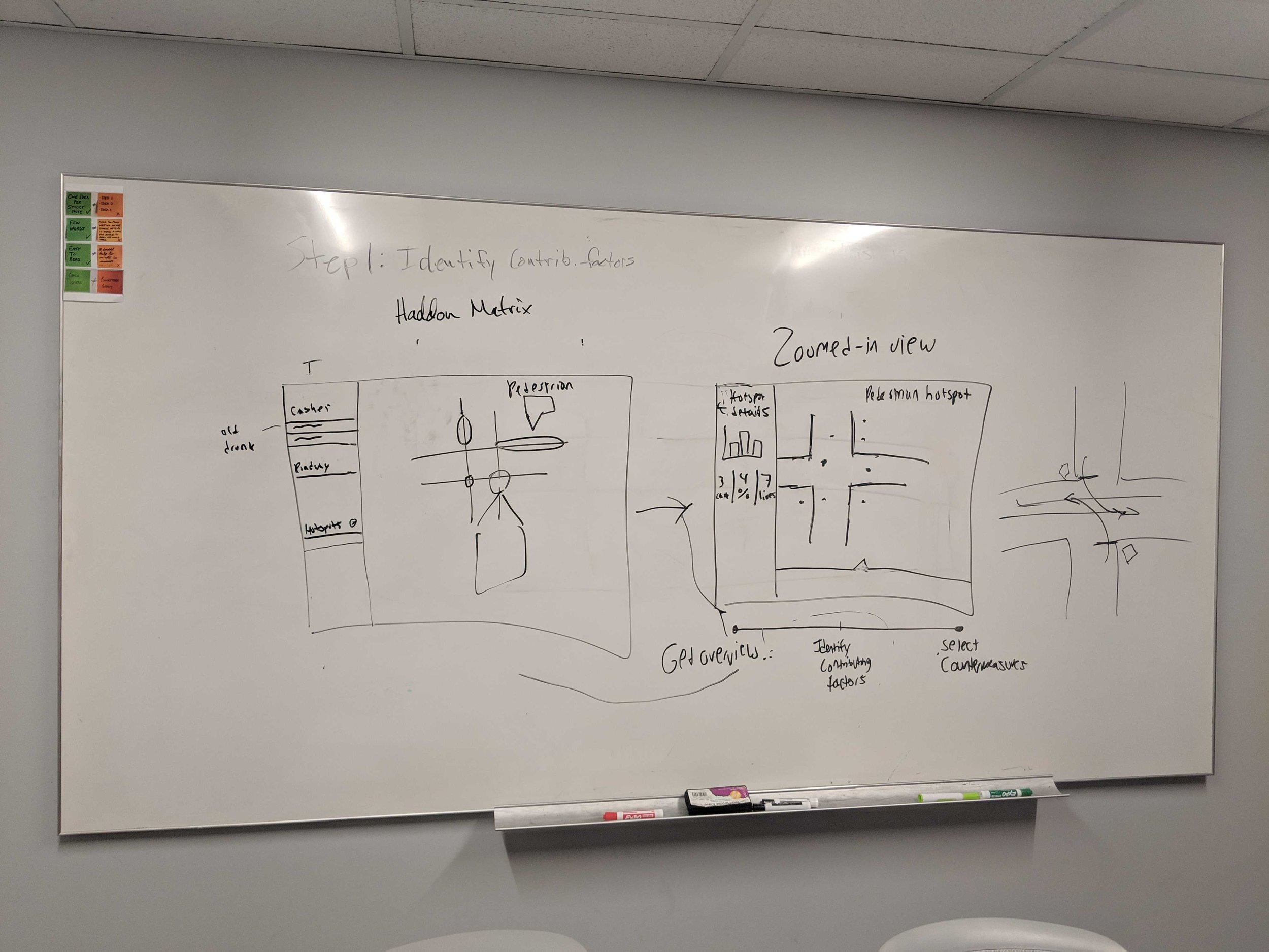
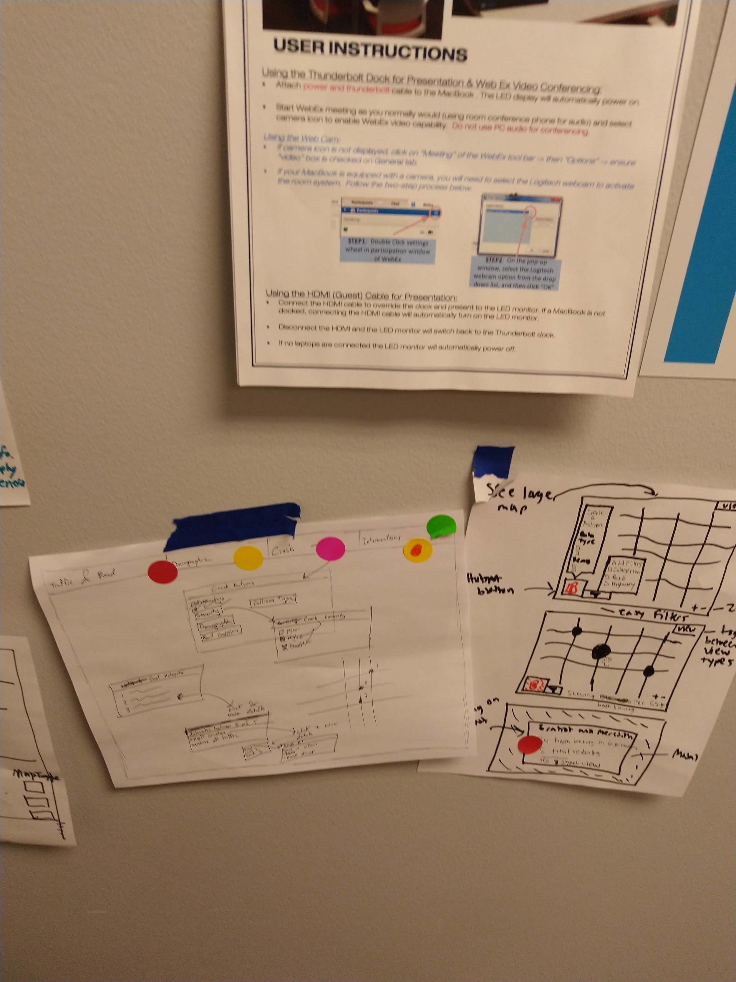
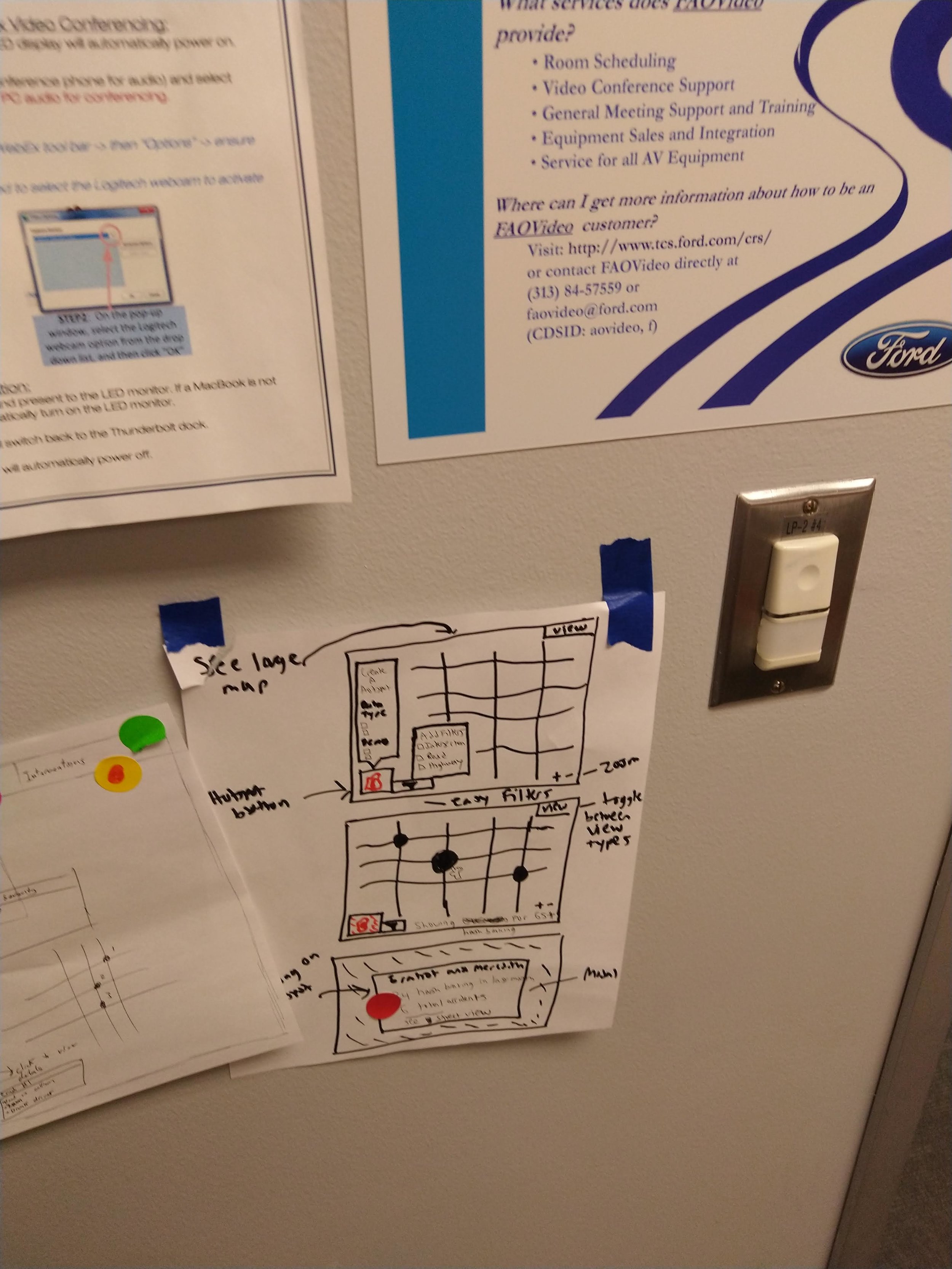
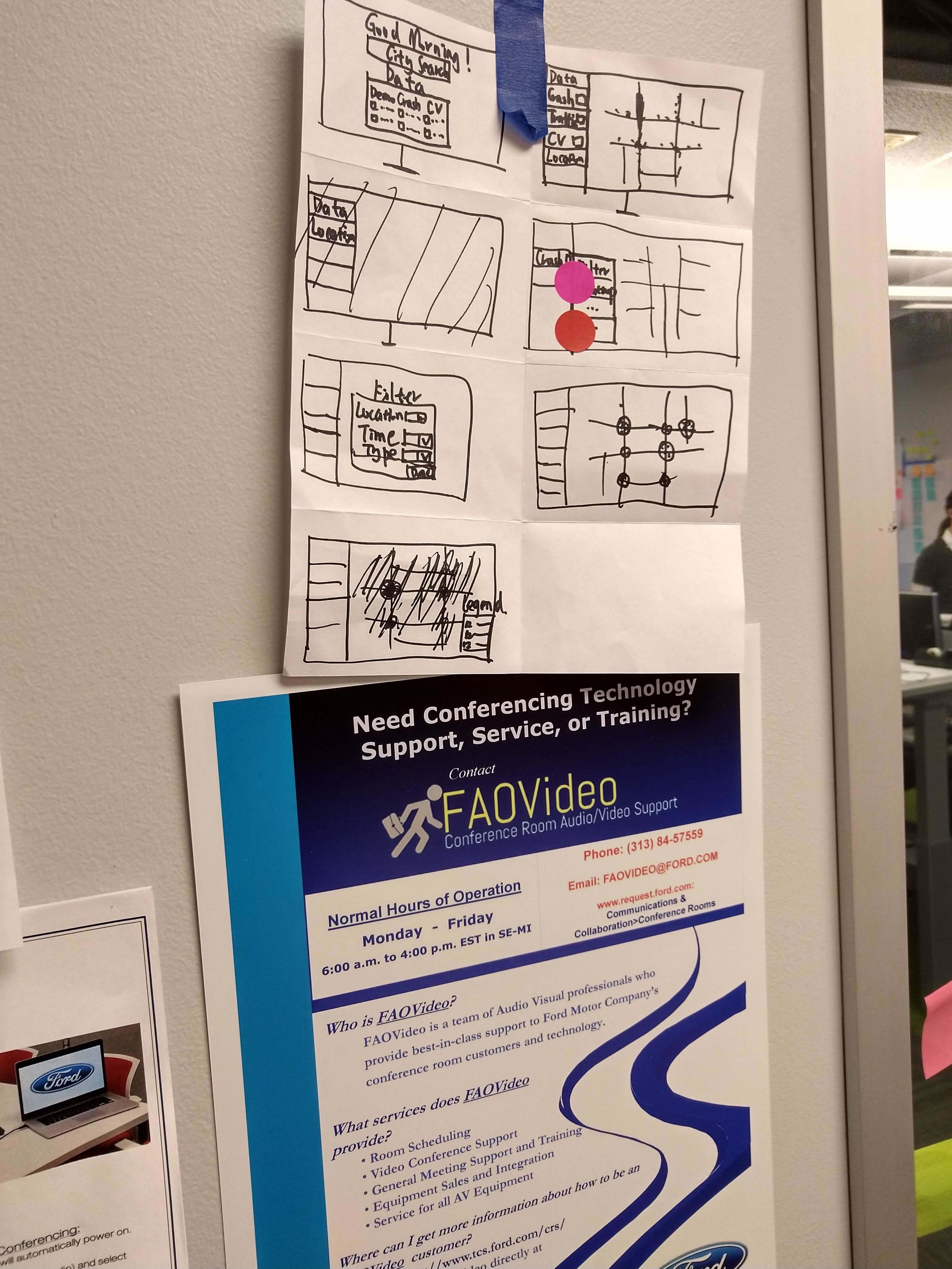
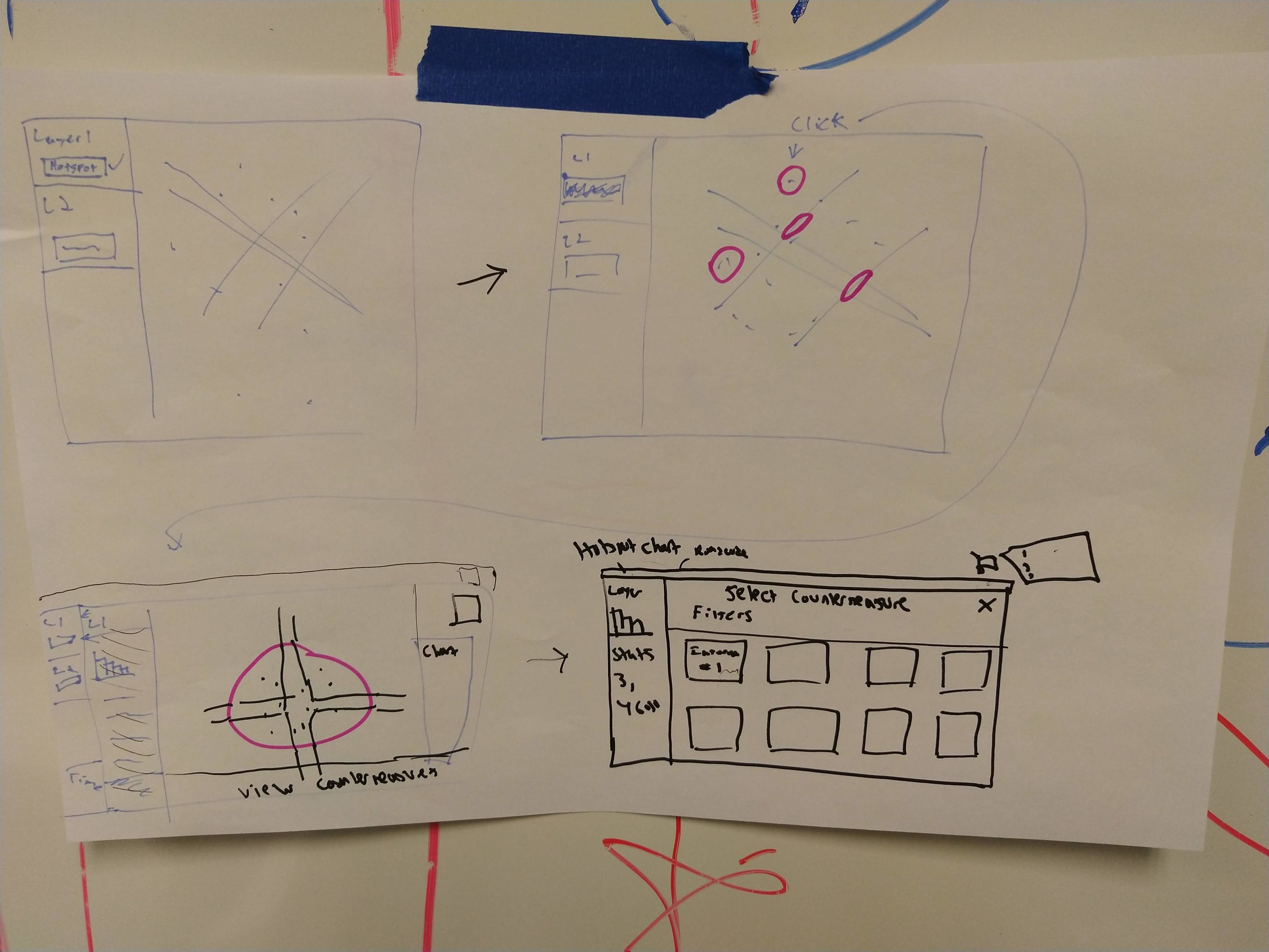
METHODS: Interviews, Personas, Design Studios, Sketching, Hi-Fidelity Comps


PROJECT MOTIVATION

When making decisions regarding traffic safety, engineers at local, county, and state road agencies are limited by the use of only one data set: crash data, which only gives information about what happened a year prior. In addition, the tools they currently use are old, clunky and hard to use.

Thus, the question my team and I set out to answer was:

How might we help traffic and safety engineers (TSEs) make better, more well-rounded decisions by allowing them to visualize and use various types of data (crash data, connected vehicle data from Ford cars, and cell phone data) all in one easy-to-use interface?


MY CORE RESPONSIBILITIES

Note: This was a 0-1 design project, going from a concept that didn’t exist to working MVP in 3.5 months.

  • Led the overall design experience, from the flow to the final visual design crafting everything from scratch.

  • Collaborated with the Product Owner and Product Manager on creating a roadmap and vision for the future.

  • Led user research and all facilitation / workshopping exercises with the team.


KEY FEATURES OF ROADCODE

Get better context surrounding crashes

TSEs get a richer view of what is happening in their cities and counties by visualizing traditional crash data alongside other innovative data sources such as viewing pedestrian volume and data coming from Ford connected vehicles (hard braking/hard acceleration events).


The tool allows TSEs to slice and dice the data so, if, for instance, they want to see crashes with pedestrians and bicyclists, they are able to easily add a layer with these filters.

The tool allows TSEs to slice and dice the data so, if, for instance, they want to see crashes with pedestrians and bicyclists, they are able to easily add a layer with these filters.


Identify crash hotspots

RoadCode also helps TSEs quickly identify areas in their jurisdiction where there are a higher than expected amount of accidents occurring. No other tools allow them to create these custom crash hotspots on the fly.

In this example, the user is seeing a hotspot for where there are a greater than expected amount of pedestrian and bicyclist crashes occurring. They can then compare this to the type of pedestrian volume that is flowing through this area.

In this example, the user is seeing a hotspot for where there are a greater than expected amount of pedestrian and bicyclist crashes occurring. They can then compare this to the type of pedestrian volume that is flowing through this area.


Simulate solutions for these hotspots

After identifying these areas with potential for improvement, TSEs can find solutions to alleviate the crashes occurring at a given intersection or road segment, while also providing ROI information about how many crashes a given solution will prevent.

Our table provides estimates for the number of crashes that a given countermeasure will reduce along with the associated cost savings.

Our table provides estimates for the number of crashes that a given countermeasure will reduce along with the associated cost savings.

 
charcoal.png
 

RESEARCH PROCESS


DISCOVERY & KNOWLEDGE TRANSFER

Because the product owner, data scientist, and safety analyst had been working on the idea (but not the product) behind RoadCode for quite some time, we spent the first week collaborating and doing a deep dive to understand the problem space we were in and who we would be building RoadCode for. This kicked off the theme for the project and a key to success: constant collaboration.


The first week, we spent a lot of time in this room as I facilitated exercises so that our team could understand what problem we were tackling and we could align on our goals for the outcomes of the project.

The first week, we spent a lot of time in this room as I facilitated exercises so that our team could understand what problem we were tackling and we could align on our goals for the outcomes of the project.


Research

With some knowledge of RoadCode and the problem space that we were solving for, I then led research efforts to better understand the problems that TSEs were facing in regards to traffic safety and to see if this matched up with the original hypotheses of what RoadCode could solve. Throughout the three months, we interviewed TSEs and similar potential users, to understand their needs and to get designs and concepts in front of them.

From this research, the general idea and need for what RoadCode set out to do was validated and additionally, it gave our team new insights to consider. I found it invaluable to have my engineering teammates join along for at least some of the research as they could then contribute later to ideation sessions.

Groupings findings from some early user interviews.

Groupings findings from some early user interviews.


PErsona

Based on insights from our research and the previous research conducted, we created a main persona (“Stretched Thin Steve”) who we the primary user of RoadCode. We constantly referred back to Steve when considering what to implement next in RoadCode.


DESIGN STUDIOS

Because our full team had insight into the purpose of RoadCode and our users needs, I found it helpful to facilitate several design studios to collaboratively sketch out various ideas for RoadCode and what the flow and design would become. Design studios allowed the whole team to get engaged in the design process and ensured that we unearthed better ideas than I could brainstorm alone.


Designs that came out of the design studios helped to inform the “real” design of what RoadCode would become.

Designs that came out of the design studios helped to inform the “real” design of what RoadCode would become.

 
lightgrey.png
 

DESIGN PROCESS AND CONSIDERATIONS

Sketches & Early wireframes

Design studios, my own sketches, and quick wireframes were helpful in figuring out the initial design of RoadCode. I constantly involved my team in this process and got these in front of our subject matter experts and TSEs that we had access to.


DESIGNING THE FLOW of the tool

As mentioned earlier, the idea for RoadCode was that TSEs could follow three steps (visualize a variety of data, identify crash hotspots, and simulate countermeasures for those hotspots). However, we knew that this wasn’t necessarily a truly step-by-step process but rather that TSEs would spend the vast majority of their time visualizing various types of data on the map first. When designing RoadCode, I took this into consideration: the main focus here was the map portion and visualizing various data layers on the map.

THE BASE OF ROADCODE


RoadCode was designed to be a flexible, map visualization tool. The user could add several layers onto the map at once and customize what they wanted to see.

RoadCode was designed to be a flexible, map visualization tool. The user could add several layers onto the map at once and customize what they wanted to see.


ADDING LAYERS AND VISUALIZING DATA
Instead of a linear process, RoadCode was designed to allow the user to quickly turn on and off layers and customize these layers as they like. This allows the user to “play” with the various data available to them, quickly and efficiently customizing the information they see.


Adding A Crash Explainer.png


ITERATIONS

Like with any design project there were a variety of iterations along the way. Here are just a few examples of the iterations that I made along the way.

EXAMPLE 1 - LAW OF LOCALITY

In early iterations of exploring how users will add a layer onto the map, I tried and tested several options. The final version abides by the Law of Locality which states that interface elements should be placed near where they affect change. The other options had some downsides which are explained below.


Law of Locality.png


EXAMPLE 2 - AVOIDING REDUNDANCY

In an earlier version, I had designed RoadCode to give users the ultimate flexibility. They could add any crash layer they liked and also similarly set filters to add crash hotspots.

With this in mind, I split out the hotspot layers from the crash layers with the thought in mind that perhaps users wanted to see fatal pedestrian and bike crashes, for instance, and at the same time turn on hotspots for a different type of crash. However, despite the flexibility this offered, this caused redundant efforts since users often wanted to see hotspot layers using the same filters they used to create a crash layer.


OriginalHotspotCreation.png


Instead what made more sense, was to allow the user to show hotspots using the same filters they used to create crash layers. I worked through several iterations of how this could work as shown below:


Hotspots Iterations.png


EXAMPLE 3 - PERSISTENT LAYERS THROUGHOUT INTERACTIONS

Another design decision regarded thinking through what the user sees after clicking one of the crash hotspots, which would bring up important details about this hotspot. My initial design iterations focused on switching the users view away from seeing their layers and instead going into a more detailed “hotspot-only” view mode. In this view, if they wanted to see the layers applied or add a new layer, they would then have to press a back arrow to go back to the main view.

 
Intial Version of Zoomed In.png
 

Instead, what I pivoted to next—with collaboration from my team—was an interaction where the user could still zoom into the hotspot but always see their layers. This was important, since a user could now easily add layers that might give further information and context about this hotspot.

For instance, in the example below, where a user is zoomed in to a hotspot for bicycle and pedestrian crashes, they may want to then add a layer to see what type of pedestrian volume is occurring at that intersection.


An example of why the layers should be persistent as much as possible. Seeing how data interacts on the map is a core functionality in RoadCode and users would want to be able to get some more context around what is potentially causing these places …

An example of why the layers should be persistent as much as possible. Seeing how data interacts on the map is a core functionality in RoadCode and users would want to be able to get some more context around what is potentially causing these places to be a hotspot.


Visual DESIGN - BUILDING FROM SCRATCH

Because RoadCode is first and foremost a safety visualization tool, I was very considerate about how to best visualize the information that went on the map.

THE MAP

MapBox is a great map platform, especially for product teams that want to add their own custom layers. However, their out of the box templates were limited, so I hopped into their design studio to customize a map just for RoadCode.


MapBox only gives an option for a Light mode and a Dark mode out of the box. For RoadCode, with all the layers we would be adding, I wanted a solution better aligned with our needs so I customized everything on the map.

MapBox only gives an option for a Light mode and a Dark mode out of the box. For RoadCode, with all the layers we would be adding, I wanted a solution better aligned with our needs so I customized everything on the map.


THE SYSTEM

Establishing a type, shadow, and spacing system upfront was extremely helpful. For the colors (and opacity used), I hand adjusted these along the way based on how the map and layers looked once actual data was added.

*For the colors, one of my favorite techniques is to saturate the grey hues with the main blue color that is used in the buttons.


I designed the colors used, spacing system, typography, shadows, form controls, tables, and any other elements that were to go on the map from the ground up, tweaking as necessary along the way.

I designed the colors used, spacing system, typography, shadows, form controls, tables, and any other elements that were to go on the map from the ground up, tweaking as necessary along the way.


CHALLENGES

From both a design and team perspective, we certainly faced a few challenges over the 3.5 months of this project. However, what I appreciated most was how collaborating helped to overcome many of these challenges.

Challenge 1: MAPS - Designs vs. “In real Life”

Fairly early on in the project, I ran into the challenge that what I envisioned would show up on the map versus what actually showed up on the map once there was real data was drastically different. The way that we overcame this was that I constantly collaborated with my engineers as they were building. Collaborating and tweaking the front-end with them was one of my favorite parts of this project and the flow of ideas that came out of these sessions helped lead to the project’s success.


Design vs IRL.png


Challenge 2: DESIGNING MAPS - WHAT NOT TO SHOW

Stakeholders and users think that they want to see as much data at once as possible, so a challenge that we faced was balancing how much to show on the map at one time. While people may think that they want to see copious amounts of layers at once, the truth is that there is only so much you can add before the map becomes unusable.

At first, I had tried to make it so that users could see many layers (6+) concurrently, but we quickly discovered that by limiting the amount of layers on the map, we could actually improve the experience. Again, constantly collaborating with my engineers to see this with real data and being creative about how to “up-pop” and “down-pop” elements on the map were key.


By reducing, we can make things actually easier to use.

By reducing, we can make things actually easier to use.


lightgrey.png
 

FEEDBACK FROM USERS

As RoadCode entered the commercialization process, an internal team at Ford had begun pilots with TSEs in Michigan. This is some of early the feedback the team had received.

Quotes.png
 
charcoal.png
 

ROADCODE DEMO

Check out the video below to see RoadCode and how our system helps traffic and safety engineers make better informed traffic safety decisions.


Demo begins at 0:35. Video created by Isaac McRobie.


OUTCOME


RoadCode Success


As a result of the success of the project, RoadCode:

  • Finished 2nd out of over 50 companies in the US Department of Transportation’s competition beating Uber, Allstate, and others

  • Launched to market by Ford, rebranded to “Safety Insights”, garnering customers in the US and Canada