Fresh EBT
My Stash: Stretching Food Stamp Benefits

ROLE: UX Research & Design
TEAM: Lead Designer and CEO
TIME: June - August 2017
METHODS: Interviews, Surveys, Observations, Brainstorming, Prototyping, Usability Testing
PROJECT MOTIVATION
The average SNAP recipient spends 80% of their benefits in the first nine days and by Day 21, the average SNAP recipient has spent their entire food stamp balance.
What if we could design a feature within Fresh EBT that helps our users stretch their benefits a few more days, leading to having food later in the month and more positive health outcomes?
UX RESEARCH PROCESS
USER INTERVIEWS & OBSERVATIONS
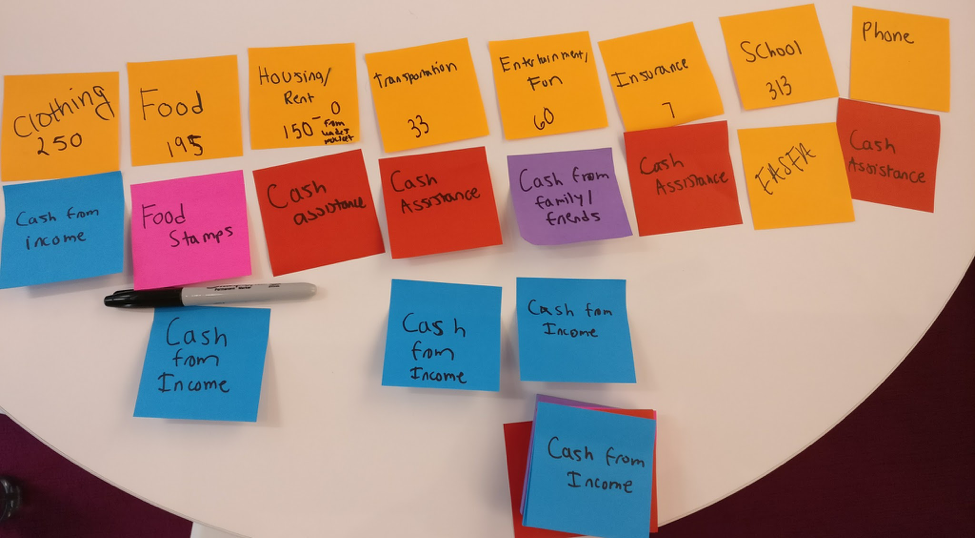
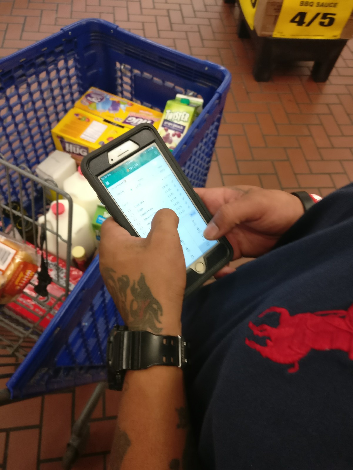
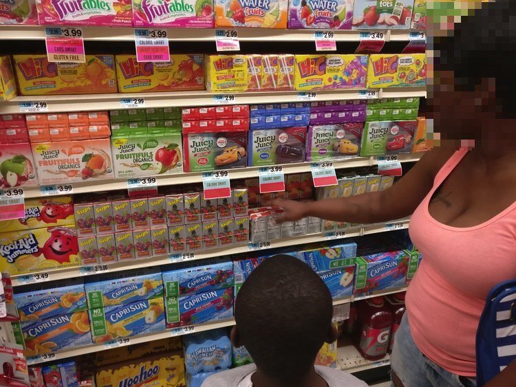
I conducted 18 in-depth interviews and two grocery shopping observations to learn more firsthand about the shopping habits and pain points of our users as they tried to make their food stamp budgets last for the whole month.
My research questions at this phase were:
How do Fresh EBT users currently manage their food stamp benefits?
How do Fresh EBT users think about their benefits?
SURVEYS
With data from my interviews and after conducting two surveys, I found that our users largely fell into two groups, based on on how well they were able to manage their monthly food stamp budget, which I coined "Optimizers" and "Non-Optimizers."

A high-level breakdown of our two user types. The vast majority fell into the Non-Optimizer group.
PERSONAS
Using the findings from the interviews, observations, and surveys, I worked with Kaela, our lead designer, to create and expand upon our existing personas, settling on five personas that fit into the Optimizers and Non-Optimizer groups.

An example of one of the three personas that fell into the Non-Optimizer group that could use the most help with stretching their benefits.
UX DESIGN PROCESS
INDIVIDUAL BRAINSTORM & MOCKUPS
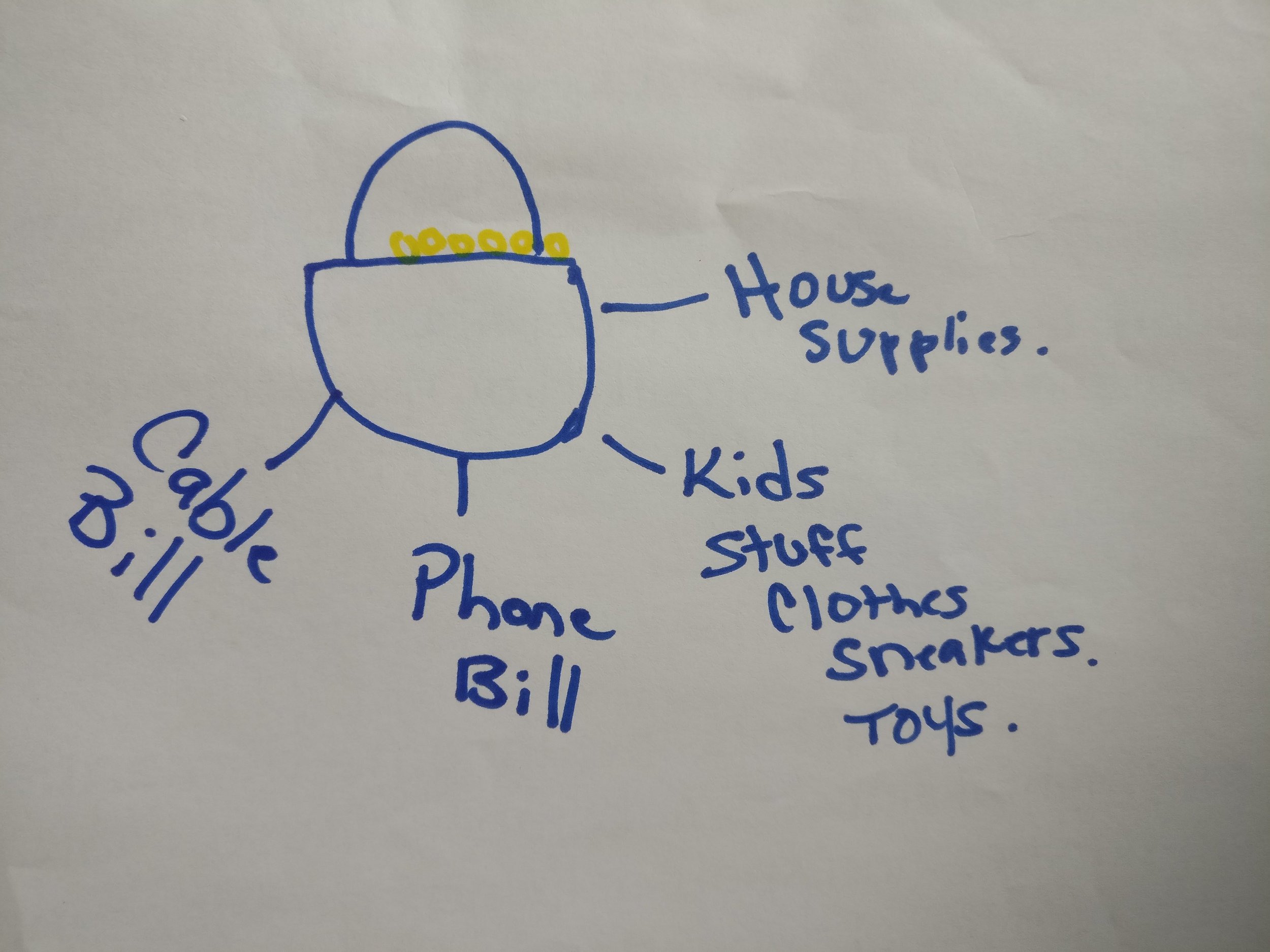
From my user research and persona creation, I had several important findings about users in regards to how they managed both their SNAP benefits and "real" money. These included:
For Non-Optimizers, their food stamp benefits often depleted quickly because of impulse buys, particularly on snacks.
Money Guards - Users used a variety of systems and methods to control impulses and keep distance from “real” money such as giving money to a friend or family member, buying and hiding of money orders, and saving a $5 bill anytime they had one in their hand.
Almost all users have friends and/or family members who also receive SNAP benefits.
A food stamp budget doesn't typically allow for the most creative of cooking, so many users tire of having the same meal over and over.
With this in mind, I mocked up several ideas to test with our users, including:
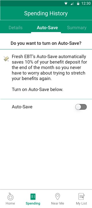
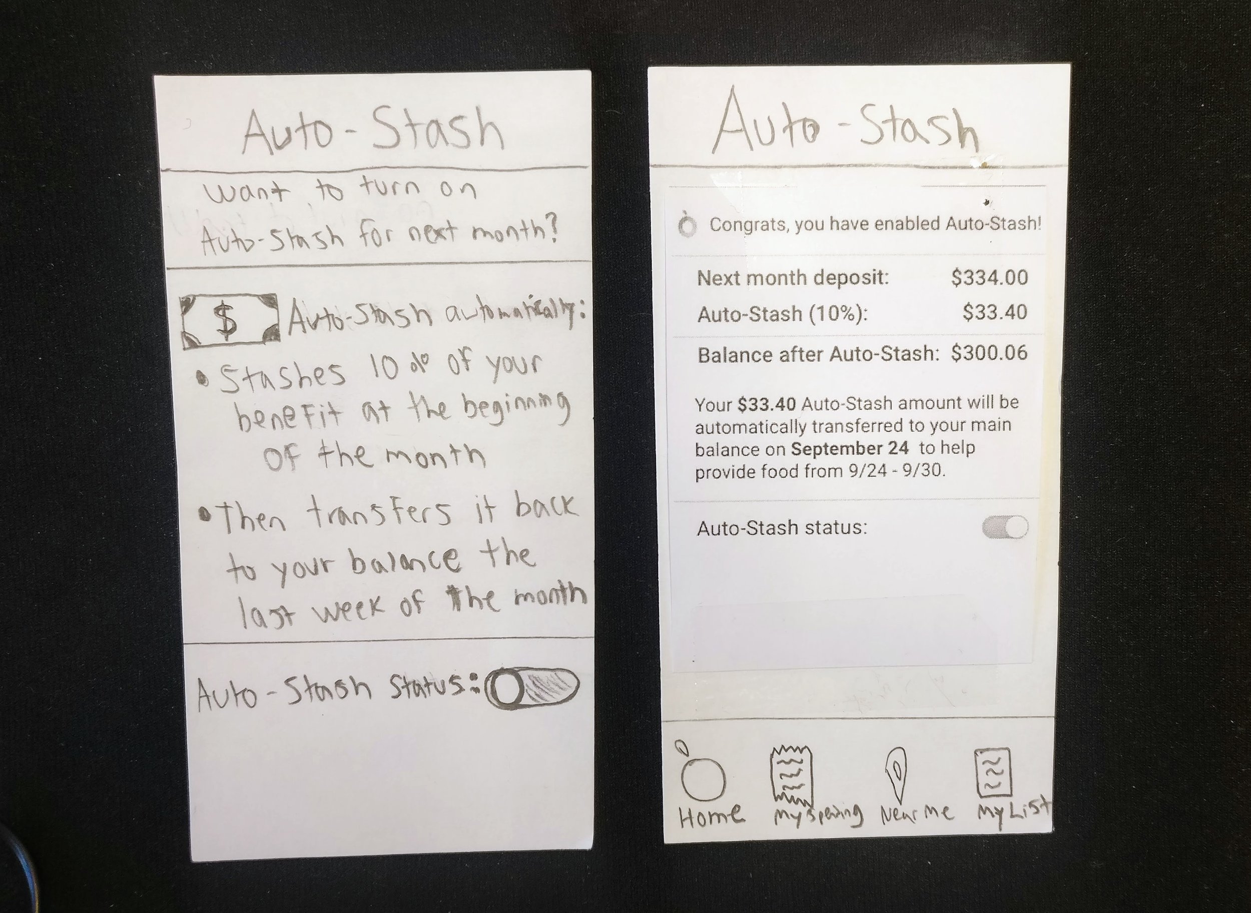
Auto-Save - Once their benefit deposit hits their account, users opt-in for this feature to save 10% of the funds for the last week of the month. In a time of need, they can transfer these funds back at any time.
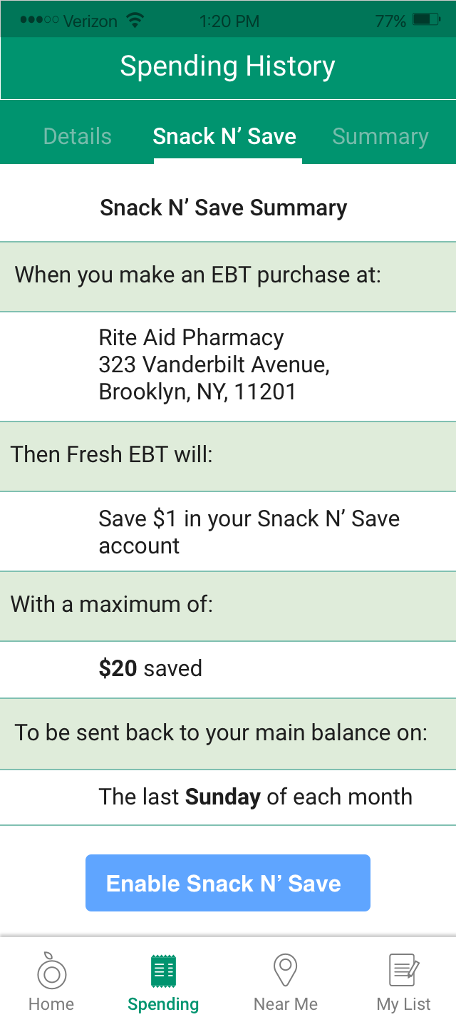
Snack N' Save - Users stash away $1 every-time they shop at a store that they typically frequent (most users bought snacks at the same store over and over) and thus have money stashed away for the end of the month when funds are low.
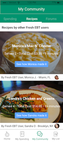
My Community - Users can see user-generated recipes from other Fresh EBT users and also compare their spending to their friends and others like them.

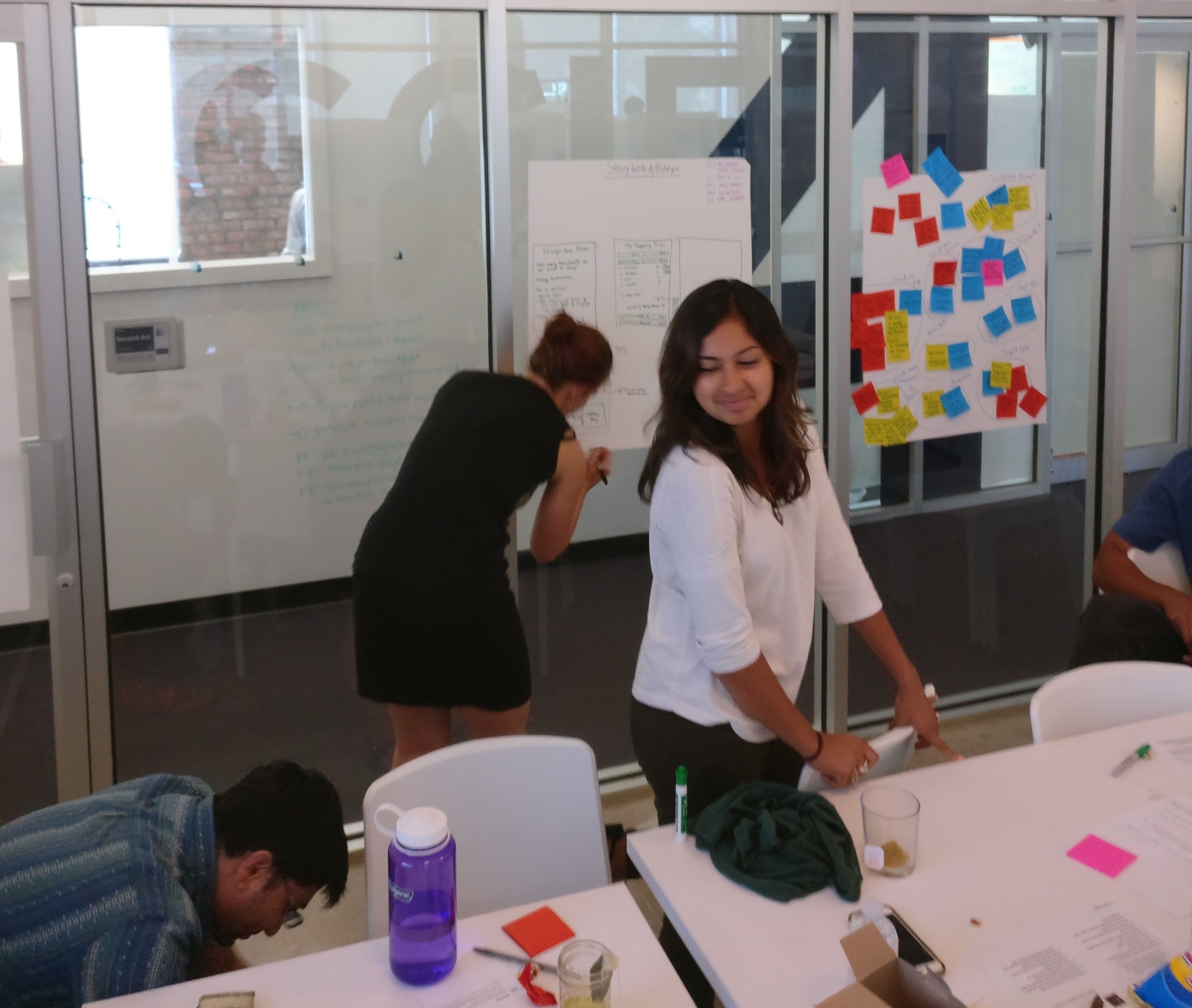
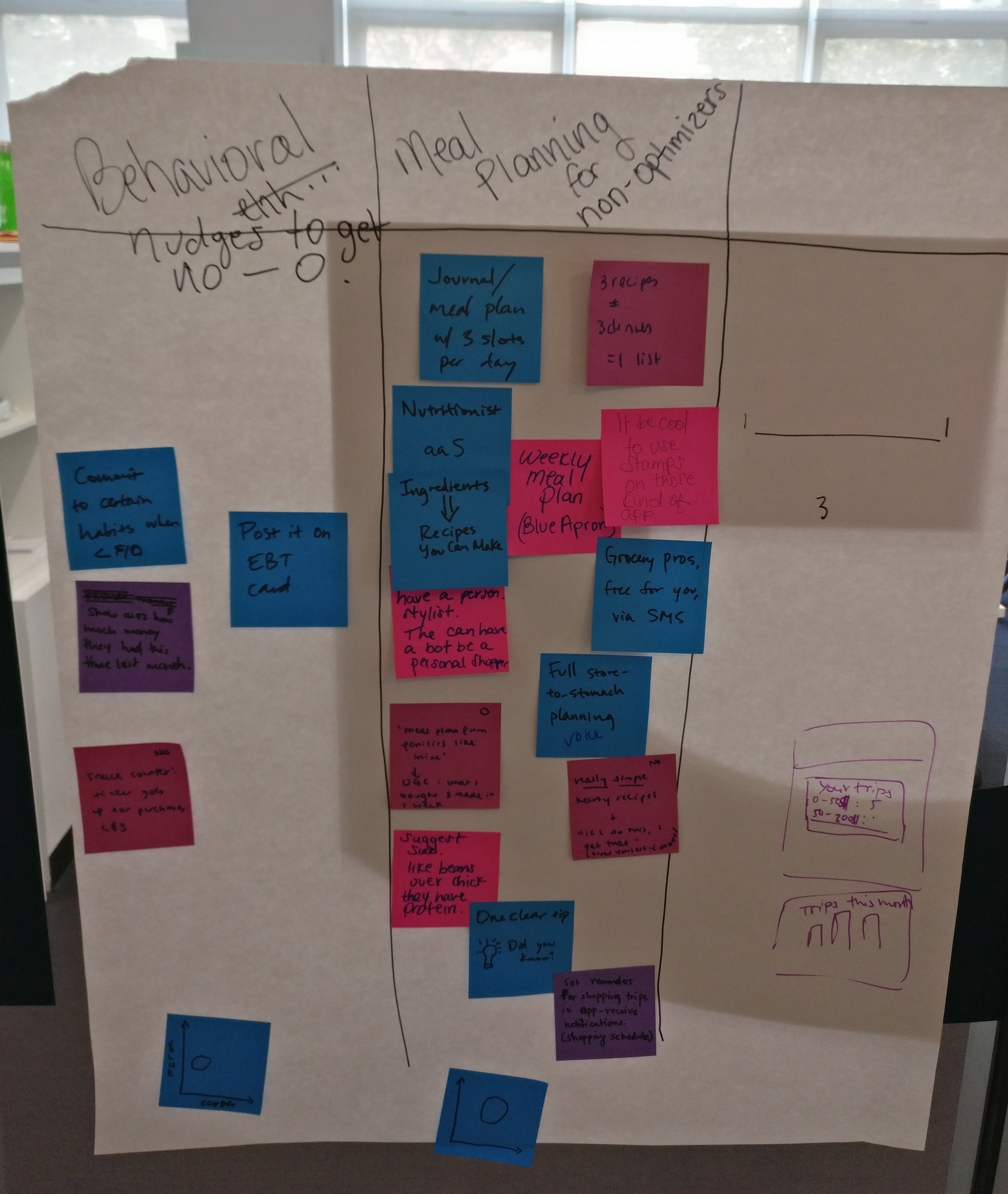
TEAM BRAINSTORM
After working with users and showing them these three initial ideas and getting their feedback, it was clear that most users favored the Auto-Save feature.
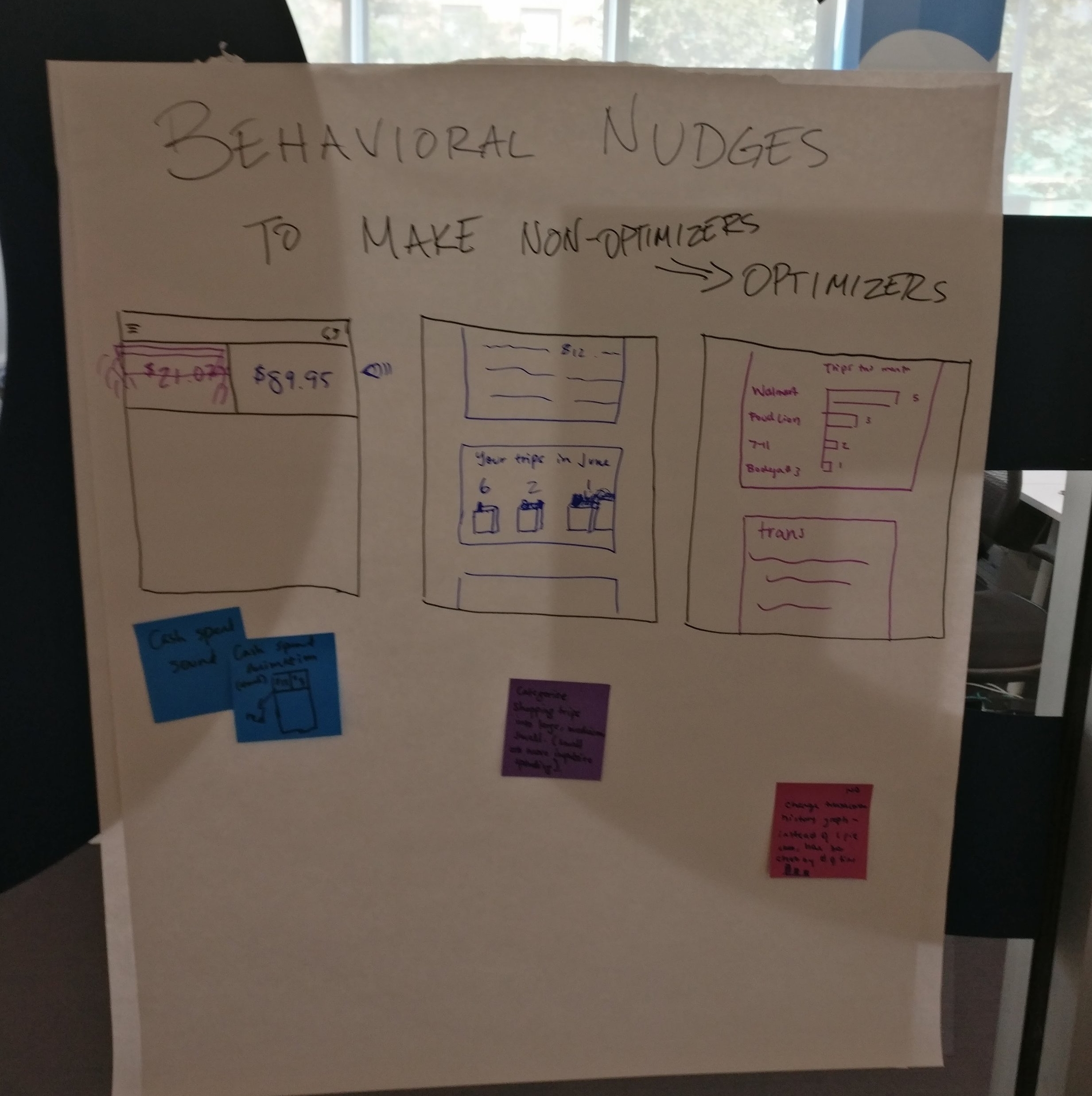
Instead of being anchored to this idea, however, I wanted to take a step back and bring in the rest of the Propel team to come up with new ideas. To do this, I facilitated a team brainstorming session which resulted in three new potential concepts.
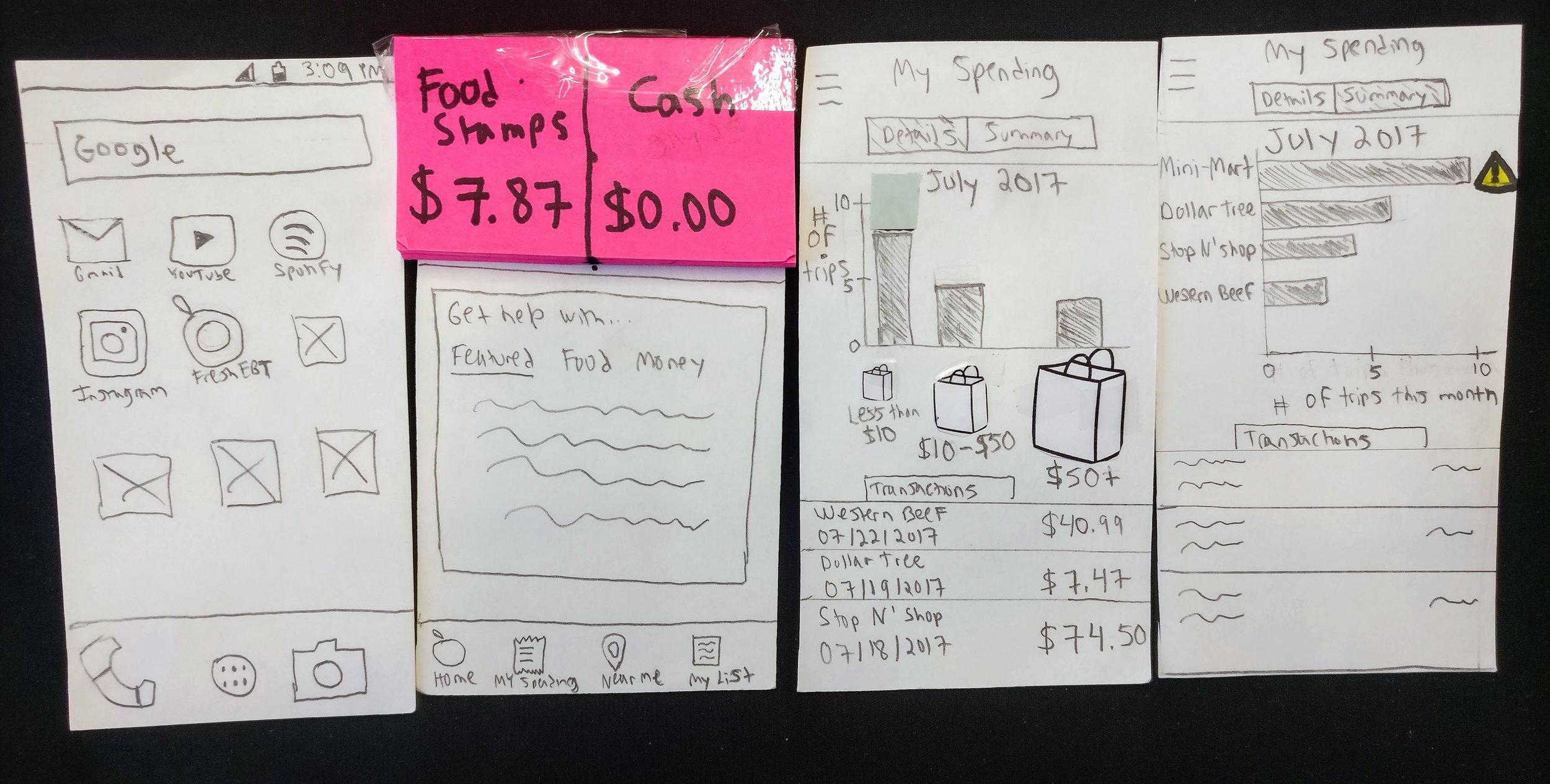
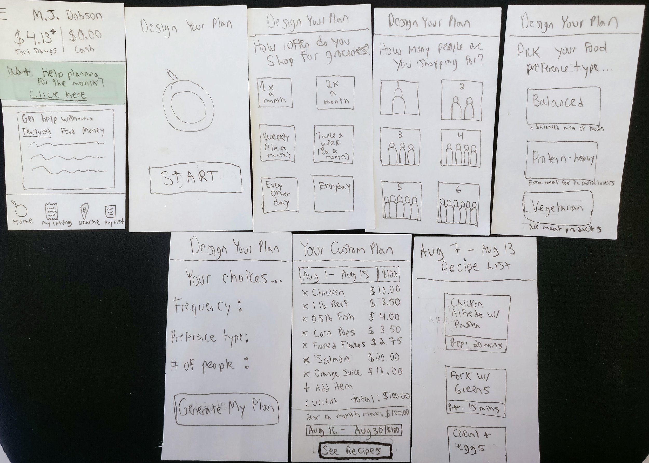
PAPER PROTOTYPES
Using the ideas from the team brainstorm, for speed and efficiency, I made paper prototypes to test with users. These new concepts were tested against the Auto-Save (now Auto-Stash) feature to see which feature would be best to move forward with. Users were given $10 to allocate towards any feature they wanted to be built into the app. Again, overwhelmingly users allocated the most amount of dollars towards Auto-Stash.
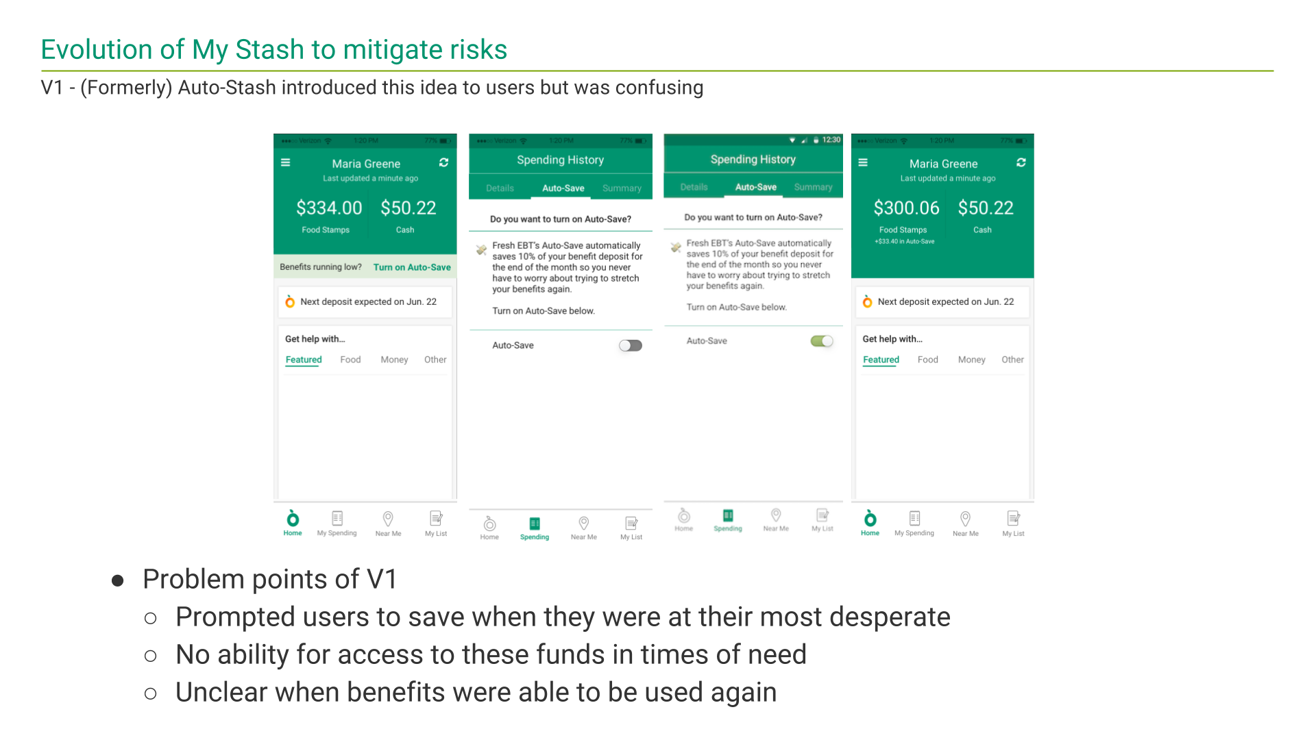
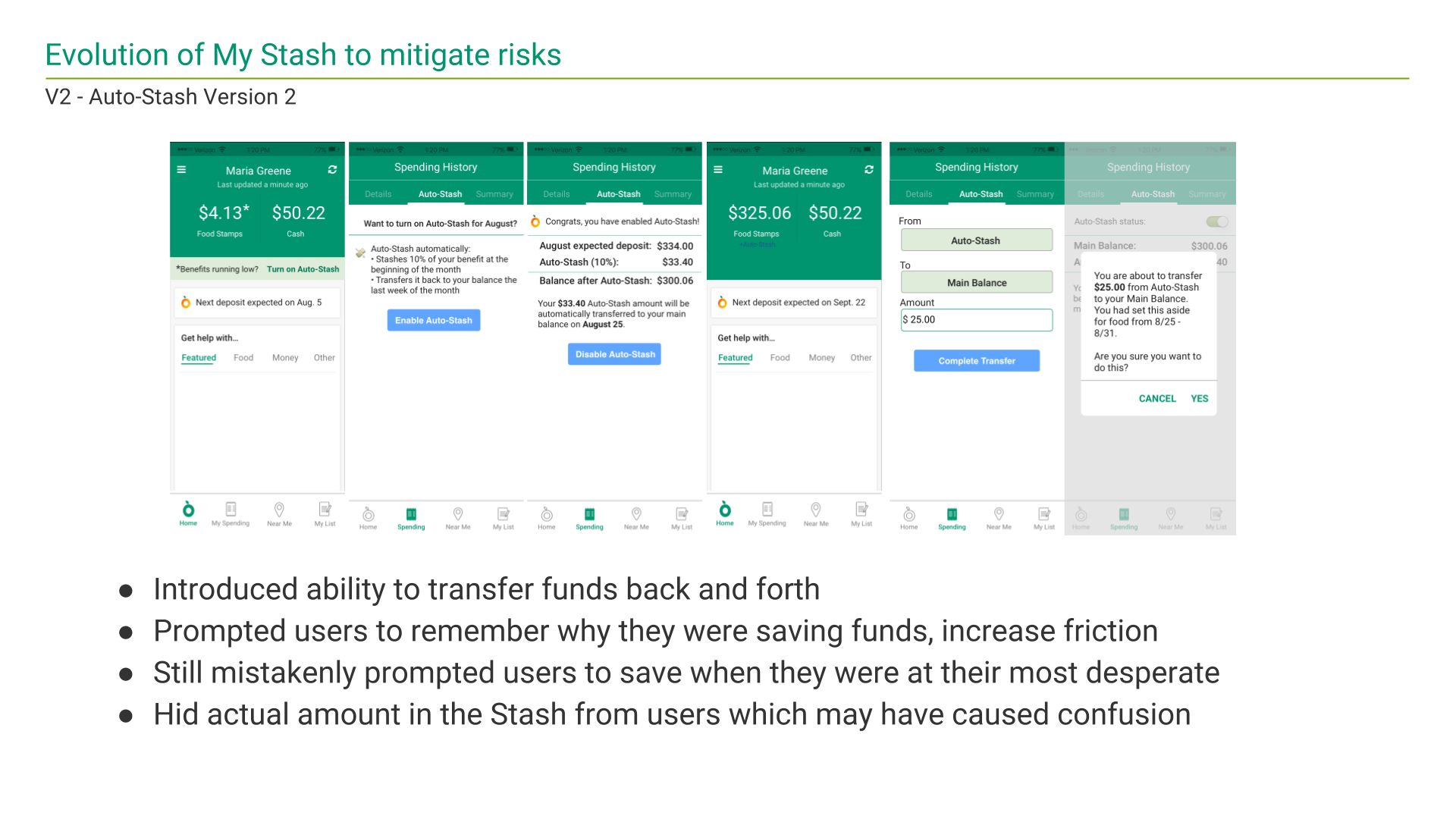
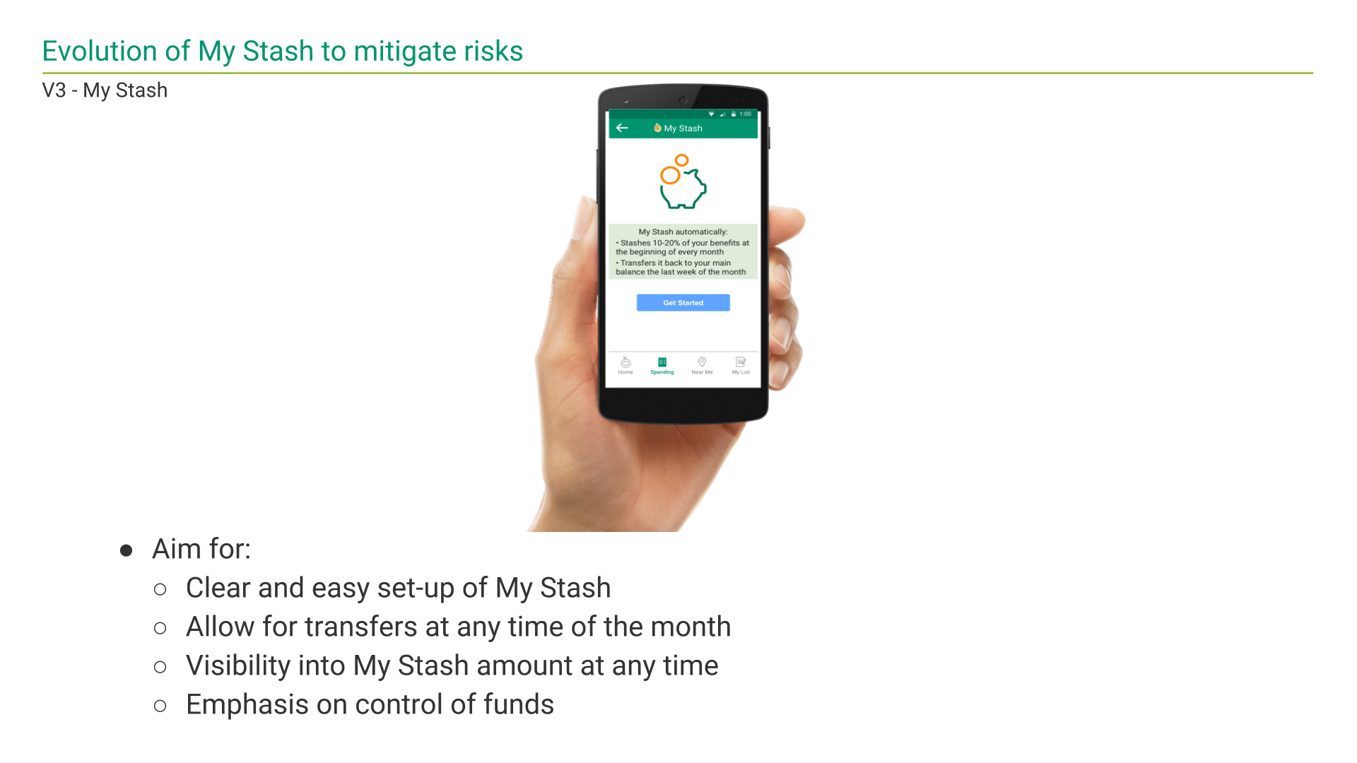
THE EVOLUTION OF "MY STASH"
The design of the My Stash process was truly an iterative process. Because it pertains to "hiding" away a portion of a user's government benefits (i.e. money), I wanted to eliminate any potential confusion and mitigate the risks of implementing this feature.
USABILITY TESTING
I conducted seven usability tests of the My Stash feature with a diverse set of our users, ranging from a young woman in her 20s to a older man in his early 60s. I gathered both qualitative feedback through in-app recording of the prototype and a post-test debrief as well as quantitative feedback using the System Usability Scale (SUS). Based off of user feedback, My Stash was a success with a SUS score of 95.0 (out of 100).
“You can stash money so you have a little bit saved up—but you can always put it back because you’re never gonna know if you’re gonna need it.”
FINAL RESULTS
My goal with My Stash was to utilize the extensive research and iterative designs I conducted to create a feature that would truly help our users stretch their food stamp benefits, allowing them to have food more days out of the month. From a business side, this would increase engagement and weekly active users (WEUs) towards the end of the month which could drive more traffic to our referral partners.

As part of my design process, I had to pitch and try to influence my team on how the rewards of the My Stash feature mitigated some of its risks.
UPDATE
At the end of the internship, the team at that time had decided not to implement My Stash because of potential risk of confusing users. However, because of the government shutdown and users missing benefits, in January 2019, the team later revived the idea for this feature.
A version of My Stash was implemented later by the team, using many of the findings from my summer there.
FEATURE - MY STASH

Click to open an interactive prototype
The "My Stash" feature allows users to stash away a portion of their food stamps for when they need it the most: the last week of the month before their next food stamp deposit hits their account.
REFLECTIONS
Designing My Stash was a full end-to-end process for me from early user research, to numerous concepts, ideas, and iterations, to in-person usability testing. It was a valuable experience for me to apply all that I have learned in my user research and interaction design classes in a real-world setting.
Working at Propel also exposed me to designing for underserved populations and the challenges that sometimes arise because of this. And ultimately, because their smartphones were the primary medium for internet access, I found most of our users to be extremely tech savvy and comfortable trying new apps and features to help with their lives. This summer experience represented how, as a designer, you can truly use tech and design for good.